01Menu
The product is in the menu.
On phones, Shop opens as a card for the cream: a picture, three reasons to try it and a button straight to the product, with stars above Reviews. All of it is editable in the theme editor.
Case study · Sensational Eyes
Sensational Eyes is a five-minute under-eye cream, sold through Lloyds Pharmacy for years and now back, direct from the brand. We built its store to the designer’s Figma: one product page that explains the cream, shows the evidence and makes the multi-buy add up.
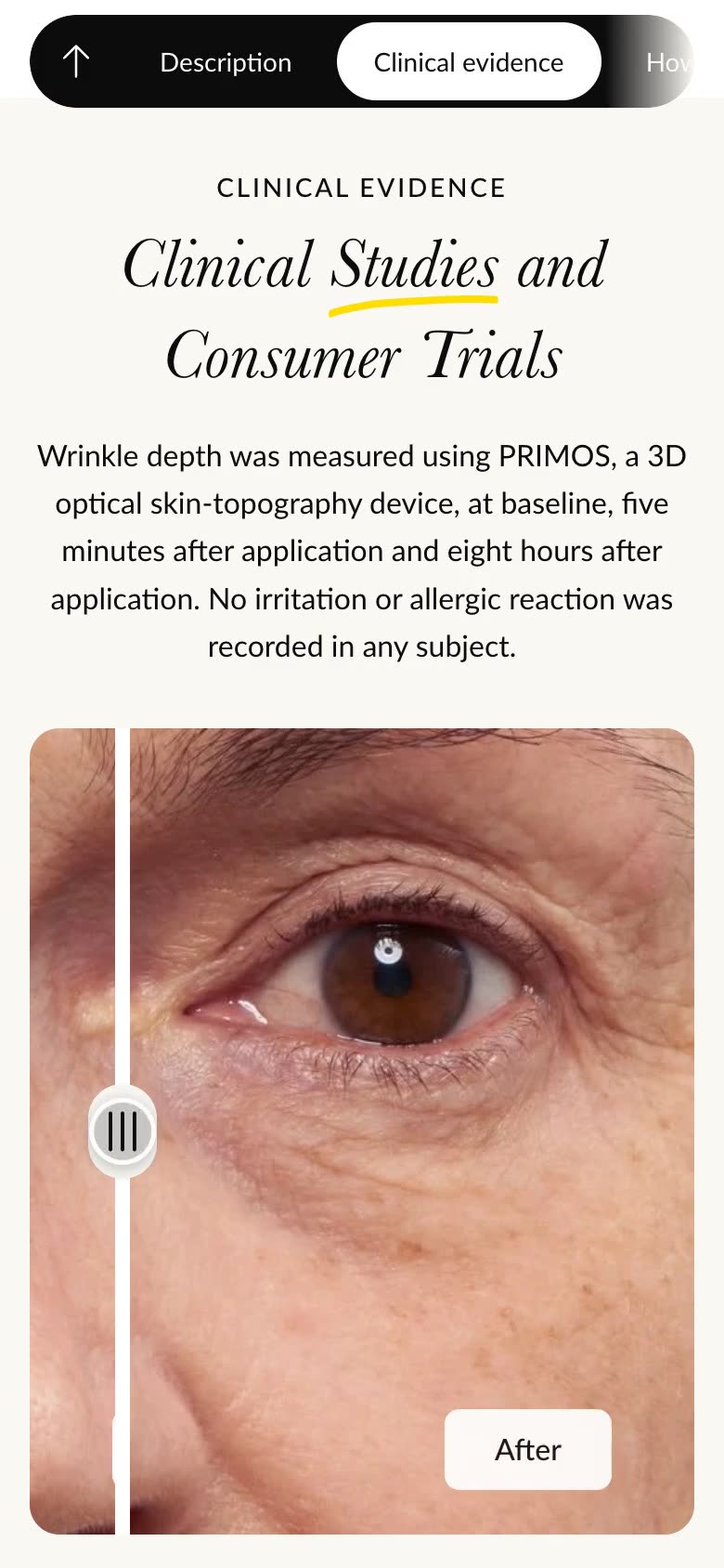
Recorded on the live store: the before and after slider on the product page, dragged one way and then the other
One-product store, built to the designDesigned by Anthony Bliss, built by Cartmasters
The brief
What we built
Each one recorded on the live store: the comparison on a desktop, the rest at phone size.
01Menu
On phones, Shop opens as a card for the cream: a picture, three reasons to try it and a button straight to the product, with stars above Reviews. All of it is editable in the theme editor.
02How we compare
Sensational Eyes against a typical eye cream, row by row: how soon it works, how it works and how long it lasts. Try the cream takes you straight back up to the buy box, and the bar of links at the top shows where you are on the page.
03Reviews
Tap Reviews in the bar of links and the page glides down to real reviews from the brand’s Amazon listing, in a section built into the theme. The team picks and edits each review in the theme editor.
Under the hood
With one product, the product page does all the selling. Three pieces sit behind it.
A shopper taps the menu card or Try the cream and lands on the product page.
A bar of links follows them down the page: the evidence, how it works, how to use it, the reviews and the comparison.
When the cream is in stock, they pick one, two or three tubes, and the price and the saving update.
The bag lists three reasons to buy under the cream, and applies the multi-buy saving on its own, as checkout does.
The welcome code never stacks on top of the multi-buy saving.
While the cream is sold out, the button becomes a form to be emailed when it’s back.
What changed
One page that explains the cream, shows the evidence and real reviews, and prices one, two or three tubes the way the bag does.
A store built to their designer’s signed-off design, with the copy, pictures, videos and offers changed in the theme editor.
Designed by Anthony Bliss. Built by Cartmasters, from design sign-off to launch.
Contact
Send a link to the design, and tell us where the product sells today.
What’s it about? Pick one to start.
Or just write to us