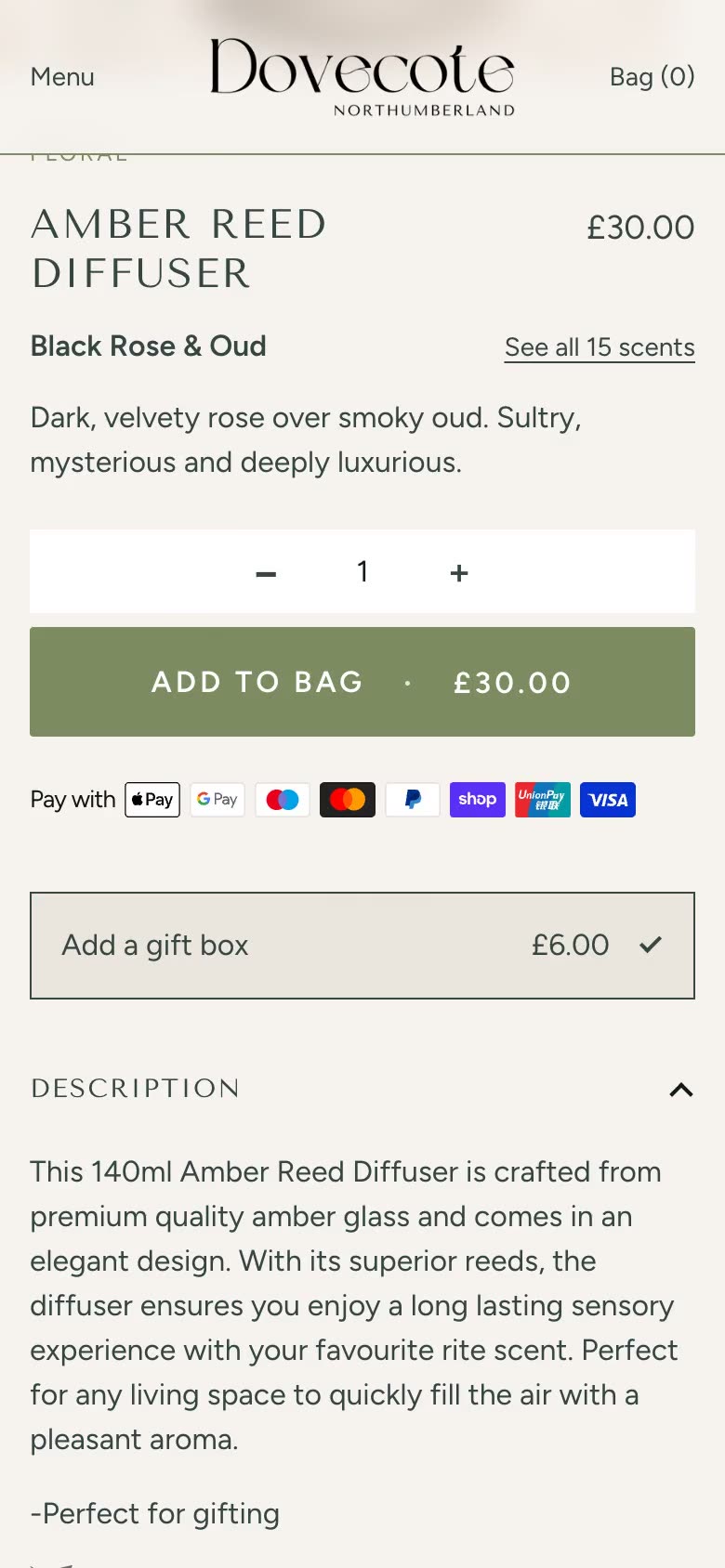
Fixes · Buy buttons
Buy it now button not the same height as Add to cart
The fix
Shopify draws Buy it now and the wallet buttons inside its own shopify-accelerated-checkout element and sets their height from a CSS variable, 44px by default on a product page. A plain height rule on .shopify-payment-button__button in your theme can lose to Shopify’s own stylesheet, so the button comes out shorter than Add to cart.
Set --shopify-accelerated-checkout-button-block-size to your Add to cart height and --shopify-accelerated-checkout-button-border-radius to its corners. Shopify supports heights from 25px to 55px. If your Add to cart is taller than 55px, bring it down to 55px, or force the height on the plain Buy it now button only.
01Why your height rule stopped working
Shopify’s developer docs say the buttons “hide their HTML in a custom element with a closed shadow DOM. Any styling or event tracking that targets the HTML structure of these buttons won’t work” (Shopify, accelerated checkout). Instead, Shopify gives a set of CSS custom properties for the height, corners and shadow.
The plain Buy it now button, the one with no wallet logo, is different. It still sits in the page as an ordinary <button> with the old shopify-payment-button__button class, so a rule aimed at it looks as if it should work. What overrides it is a stylesheet Shopify adds through {{ content_for_header }}, accelerated-checkout-backwards-compat.css, which sets that button’s height from the variable:
.shopify-payment-button__button {
  height: clamp(25px, var(--shopify-accelerated-checkout-button-block-size, 44px), 55px);
  min-height: clamp(25px, var(--shopify-accelerated-checkout-button-block-size, 44px), 55px);
  border-radius: var(--shopify-accelerated-checkout-button-border-radius, 0px);
}- 01
Your rule loads first, so it loses
When a theme loads its stylesheet before
{{ content_for_header }}, Shopify’s rule comes later with the same selector and wins. Amin-heighton.shopify-payment-button__buttonwithout!importantis ignored, and the button is 44px. - 02
The variable stops at 55px
Shopify’s docs give “The minimum supported height is
25px, and the maximum supported height is55px.” Theclamp()above holds the plain button to that range. On Shopify’s own Dawn demo store, setting the variable to 56px or 60px gave a 55px button, and 50px gave 50px (measured on a phone-sized screen, 6 Nov 2026). - 03
Wallet buttons only follow the variables
Shop Pay, Apple Pay, Google Pay, PayPal and Amazon Pay are drawn inside the closed shadow DOM, where no theme selector reaches. Their size comes from the variables alone.
Themes that load their CSS after content_for_header fare better. Dawn loads base.css well after it and styles the button with a more specific button.shopify-payment-button__button--unbranded selector, so its own min-height holds (Dawn, layout/theme.liquid).
The question comes up on Shopify Community. In one thread (Sep 2024) an owner “noticed my custom css doesn’t work anymore” once Shop Pay moved into a shadow root; the answer marked as the solution is the owner’s own, a day later, setting the variable. In another (Oct 2023), on the Ella theme, the only reply asks for the store’s address.
02Set the height through Shopify’s variables
For store owners
Find your Add to cart height
Ask whoever looks after your theme, or right-click Add to cart, choose Inspect, and read the height in the Computed tab.
Add two lines of CSS
In Online Store, click Edit theme, then Theme settings and Custom CSS (Shopify Help, adding custom CSS). Paste the first rule below with your height and corners, and save. It sets a variable rather than a height, so it doesn’t matter where Shopify’s stylesheet loads. If your theme has no Custom CSS setting, the rule can go at the end of the theme’s main stylesheet under Edit code, or ask whoever looks after your theme.
If the buttons don’t show at all
In Dawn they are the Dynamic checkout buttons setting on the product page’s Buy buttons block; look for a similar setting in your theme’s product section. Which button shows is Shopify’s choice: on a product page it “dynamically recommends a single button” (Shopify, accelerated checkout).
For developers
shopify-accelerated-checkout {
  --shopify-accelerated-checkout-button-block-size: 48px;    /* your Add to cart height, 25px to 55px */
  --shopify-accelerated-checkout-button-border-radius: 4px;  /* its corners */
}
In the cart or a cart drawer, the buttons from content_for_additional_checkout_buttons sit in a second element, shopify-accelerated-checkout-cart. Shopify’s docs give it its own defaults: 42px tall when stacked, 54px side by side, 4px corners and 8px between stacked buttons. The side-by-side height has its own variable, and the gap only applies to the cart:
shopify-accelerated-checkout-cart {
  --shopify-accelerated-checkout-button-block-size: 48px;   /* stacked */
  --shopify-accelerated-checkout-button-inline-size: 48px;  /* side by side, despite the name */
  --shopify-accelerated-checkout-button-border-radius: 4px;
  --shopify-accelerated-checkout-row-gap: 8px;              /* space between stacked buttons */
}- Shopify recommends setting the variables on these two elements. Custom properties inherit, so a wrapper such as
.shopify-payment-buttonworks too. - Over 55px: Shopify supports no more than that for any of the buttons. If a wallet can show beside your Add to cart, bring your own buttons to 55px or less. If only the plain Buy it now can show,
.shopify-payment-button__button { min-height: 56px !important; }beats Shopify’s rule; it reaches that one button and nothing inside the shadow DOM.
03Measure both buttons
Inspect each button
On a product page, inspect Add to cart and Buy it now, and compare their heights in the Computed tab. A wallet button’s own markup sits behind the closed shadow DOM, so read the height of the
shopify-accelerated-checkoutelement around it instead.Check a phone and a desktop width
Themes often change button padding at a breakpoint, and the variable is a fixed figure.
Check the cart
If the cart or drawer shows express buttons, open it with something in it and look at them stacked and side by side. A narrow drawer can stack them on its own.
Look at a wallet if you can
Shopify picks the button for each shopper, so look on more than one device: a phone with Apple Pay set up as well as a plain browser.
From our work
04An artist’s calendar shop, 12px short
On a one-product shop we built for an artist’s calendar, Add to bag is 56px tall, as is the quantity picker beside it. Our first theme rule set min-height: 52px on .shopify-payment-button__button. The theme loads its stylesheet before {{ content_for_header }}, so Shopify’s rule won, and Buy it now came out at 44px under a 56px Add to bag.
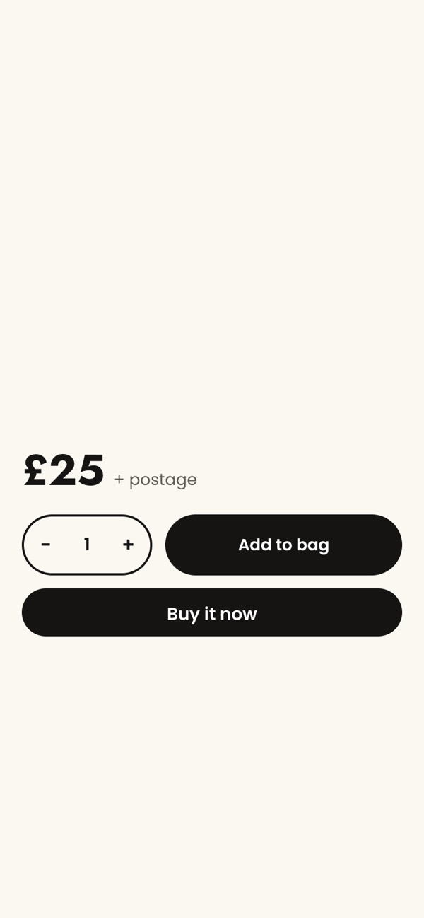
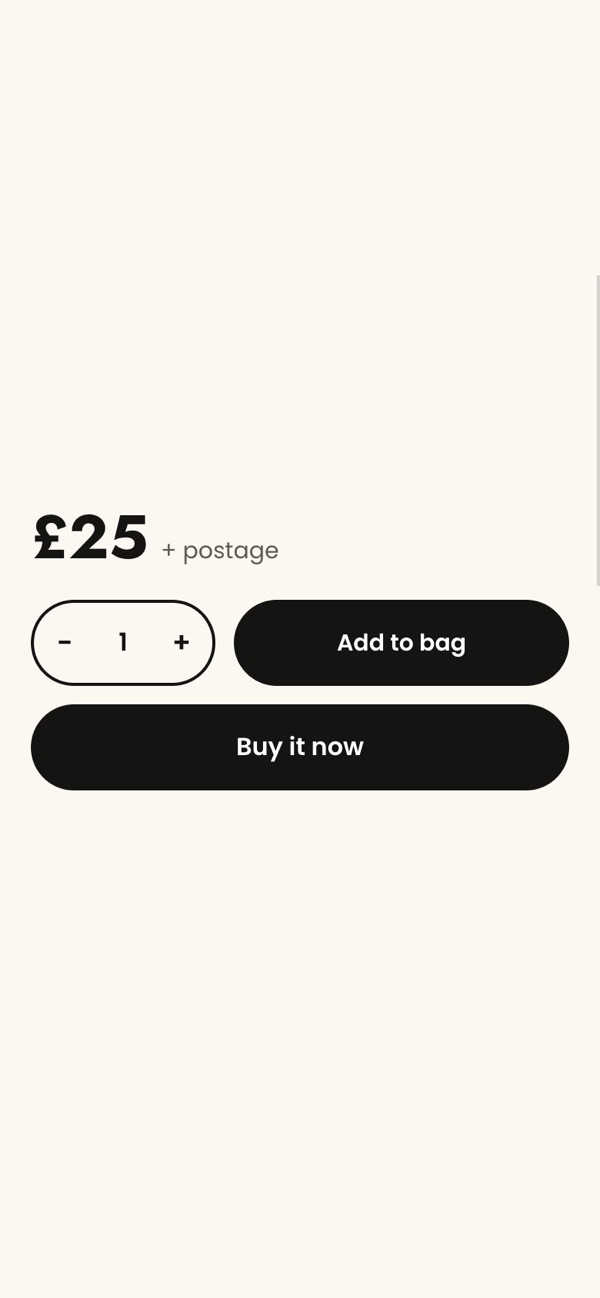
The fix (3 Nov 2026). We set the three variables on the .shopify-payment-button wrapper: a height of 56px, a radius of 999px for fully rounded ends, and a 12px row gap. Because 56px is over Shopify’s 55px, we also kept a rule on the plain button, now min-height: 56px !important.
Checked on 6 Nov 2026 at phone and desktop widths: Add to bag and Buy it now both measure 56px. With the variable alone, the button stopped at 55px, so the !important rule is what makes up the last pixel. The row gap does nothing here: Shopify documents it for the cart only, and this shop’s bag drawer has no express buttons. No wallet button showed on the product page when we checked, so we haven’t seen one beside Add to bag there. Going by the docs, it would stop at 55px.
The bigger picture
05Buttons your theme doesn’t draw
Buy it now and the wallet buttons are drawn by Shopify, not your theme, and they only take the styles Shopify allows. When the buy box is redesigned, or the theme is updated, check them on a phone and a desktop, in the cart as well as on the product page.
Building and checking the buy box, express buttons included, is part of our theme work.
06Sources
Every step and claim above comes from one of these, or from the fix on the store it describes.
- Shopify developers: Accelerated checkout (custom properties, 25px to 55px, defaults)
- Shopify developers: Liquid filters, payment_button
- Shopify developers: Liquid objects, content_for_additional_checkout_buttons
- Shopify: accelerated-checkout-backwards-compat.css, as served on 6 Nov 2026
- Shopify Help: Adding custom CSS to your theme
- Shopify Dawn theme: layout/theme.liquid (stylesheet order)
- Shopify Dawn theme: assets/base.css (Buy it now button)
- Shopify Community: Dynamic checkout button Shop Pay CSS overwrite with shadow-root(closed) (Sep 2024)
- Shopify Community: Dynamic Checkout Button height and size change (Oct 2023)
Sources checked on .