Where the site loses sales, and the changes most likely to win them back.
22 Nov 2026Prepared by Tim Fowler, CartmastersBased on your live site on 22 Nov 2026
Pages looked at
4
On desktop and phone, as a shopper sees them
Ideas
5
Best first
Competitors compared
2
First phone screen, same day
Scorecard
12/20
Checks passed, of those that apply
By Teddy already does a lot right: lovely product photos of dogs wearing the pieces, a 5.0 rating from 1,324 reviews, and Black Friday discounts that apply by themselves. The clearest gaps are on a phone product page, where the banner pushes the product below the first screen, and in delivery, where the product page and the shipping policy give two different free delivery figures (£75 and £40). This is a first look from the public pages only, so we have not seen your sales numbers or the checkout itself.
Tim Fowler, Founder and Shopify developer, Cartmasters
What to change
5 ideas, best first
Ranked by how much each is likely to help, judged from your pages, and how sure we are. Each one says what we found, where it comes from, and the next step.
1
ChangeMedium
Let the product, not the banner, fill the first phone screen
Product pages on a phone
Suggested change
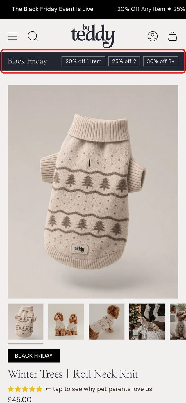
NowSuggested, with the change boxed
The offer tiers are your own (20% off any item, 25% off any 2, 30% off any 3 or more), as your banner and top bar show them.
What we found
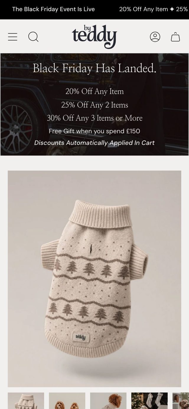
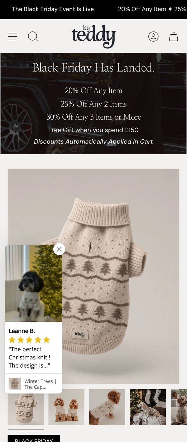
Your pagesOn a phone the product page opens on the Black Friday banner and photo; the name, price and Add to cart all start below the first screen.
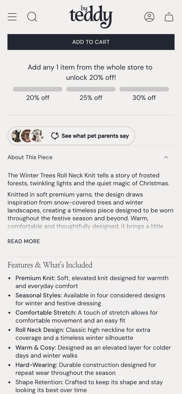
Your pagesThe same three offer tiers already show in the top bar and in the progress bar under Add to cart.
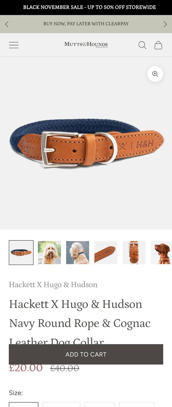
CompetitorMutts & Hounds shows the product name, photo and an Add to cart bar in the first phone screen.
The idea
Because on a phone the Black Friday banner sits above the product photo and pushes the name, price and Add to cart below the first screen, we think a one-line offer strip will bring the product and its price into view at once, for phone shoppers opening a product page. The same holds for any banner placed there after the sale ends.
Reach
Everyone who opens a product page
Impact
HighAmong the biggest wins in this audit
How sure
MediumBacked by your pages and what competitors do
Next step
Test it firstIt changes the first thing phone shoppers see on every product page, so compare it with the current page.
Measure it by: Add to cart rate on phone product pages
2
FixHunch
Make the free delivery figure the same everywhere
Product page Shipping tab and shipping policy
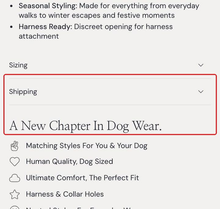
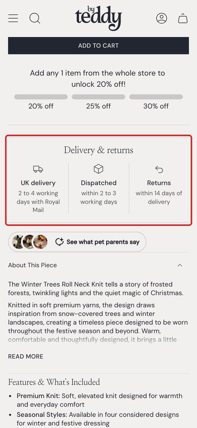
The closed Shipping tab on the phone product page, where the £75 figure sits.
What we found
Your pagesThe product page's Shipping tab says "Complimentary UK Shipping Over £75".
Your storeYour shipping policy says UK standard delivery is "free when you spend over £40".
Best practiceA delivery promise that changes from page to page makes shoppers doubt the rest.
The idea
Because the product page's Shipping tab says "Complimentary UK Shipping Over £75" while the shipping policy says UK standard delivery is free when you spend over £40, we think showing one figure in both places will stop shoppers being put off or surprised, for UK shoppers with a basket between £40 and £75. Which figure checkout charges was not checked.
Reach
Everyone who opens a product page
Impact
HighAmong the biggest wins in this audit
How sure
HunchBacked by your pages and good practice
Next step
Just do itTwo figures for the same promise is a fix, not a test.
Measure it by: Checkout starts from the basket
3
NewMedium
Put delivery and returns facts next to Add to cart
Product pages
Suggested change
NowSuggested, with the change boxed
Every line is from your own shipping and returns policy: UK standard 2 to 4 working days, Royal Mail, dispatched within 2 to 3 working days, returns within 14 days of delivery.
What we found
Your pagesDelivery is only inside the closed Shipping tab, and returns are only in the footer.
Your storeYour policy: dispatched within 2 to 3 working days, UK standard 2 to 4 working days by Royal Mail, returns within 14 days of delivery.
CompetitorMutts & Hounds puts "Free delivery on all UK orders over £150." with a van icon under Add to cart.
The idea
Because delivery times and the 14 day returns window are only in a closed Shipping tab and the policy pages, we think a short row under Add to cart with dispatch, delivery and returns will answer the last questions before buying, for product page shoppers. The free delivery figure can join the row once one figure is settled.
Reach
Everyone who opens a product page
Impact
MediumA solid win, behind the top ideas
How sure
MediumBacked by your pages and what competitors do
Next step
Test it firstIt adds a block beside the buy button, so check it lifts adds to cart rather than distracting.
Measure it by: Add to cart rate on product pages
4
FixHunch
Keep the review pop-up off the basket and the main photo on phones
Basket and product pages on a phone
Suggested change
NowSuggested, with the change boxed
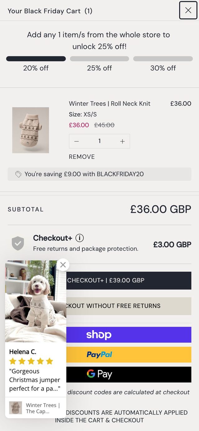
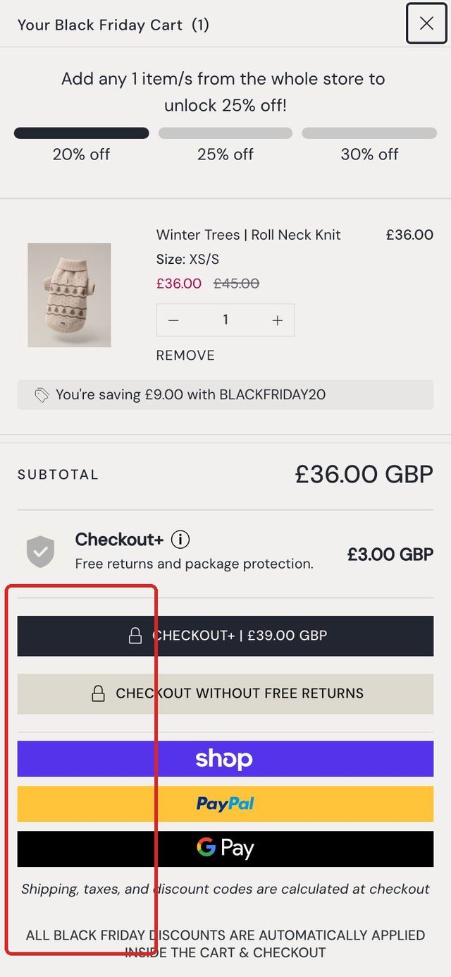
The review card is your own Loox pop-up, as it opened over the basket during our visit.
What we found
Your pagesIn the phone basket the review card covers the left of the Checkout+ and checkout buttons.
Your pagesOn the phone product page the same card covers the lower left of the main photo.
Best practiceNothing should sit over a checkout button; reviews work best beside the product, not on top of it.
The idea
Because a floating review card opens over the checkout buttons in the phone basket and over the main product photo, we think keeping it off the basket and away from the photo on phones will clear the way to checkout, for phone shoppers.
Reach
Everyone on phones
Impact
MediumA solid win, behind the top ideas
How sure
HunchBacked by your pages and good practice
Next step
Just do itA pop-up covering checkout is a fix, not a test.
Measure it by: Checkout starts from the basket on phones
5
FixHunch
Say when the Black Friday offer ends
Banner, top bar and basket
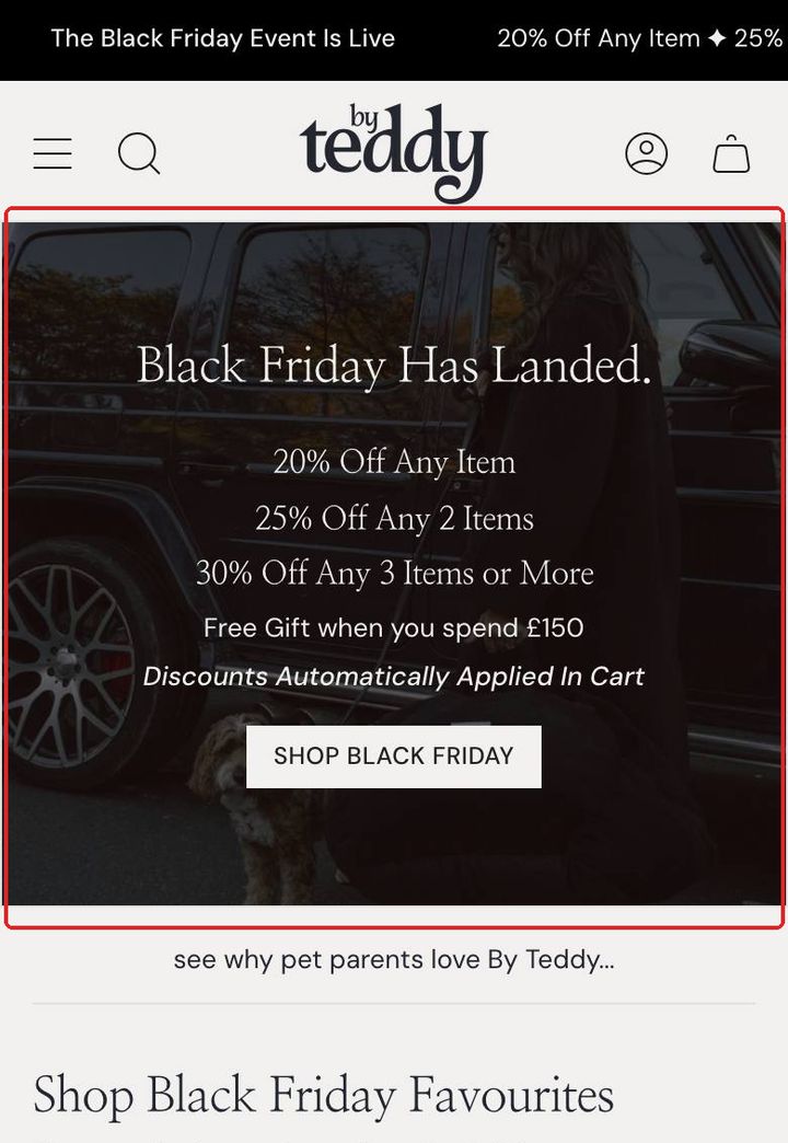
The phone home page banner with the Black Friday tiers and no end date.
What we found
Your pagesBlack Friday tiers show in the banner, top bar and basket; no end date is stated on any page we visited.
Best practiceA real end date gives a reason to decide today; an invented one costs trust.
The idea
Because the Black Friday tiers show in the banner, top bar and basket but no end date is given anywhere we looked, we think stating the real end date will give shoppers a reason to buy now rather than later, for every visitor during the event. This one only applies while the Black Friday event runs.
Reach
Every visitor
Impact
LowWorth doing, smaller than the rest
How sure
HunchBacked by your pages and good practice
Next step
Just do itThe event is short, so there is no time to test it; just add the date.
Measure it by: Orders per day during the event
How you compare
What two competitors do on the same product page
The first phone screen of each product page, captured the same day. Only what bears on getting someone to buy.
By TeddyYour product page, first phone screenMutts & Hounds
Product page on a phone: name, photo and an ADD TO CART bar all in the first screen
Under the button: "Free delivery on all UK orders over £150." with a van icon
Second top bar: "READ OUR TOP RATED CUSTOMER REVIEWS"
Hugo & Hudson
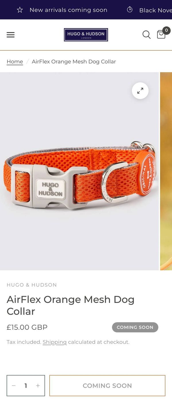
Product page on a phone: name and "£15.00 GBP" in the first screen
Top bar: "Free UK Shipping On Orders Over £50* Excluding Beds"
Top bar: "Sign up to our newsletter and enjoy 15% off your first purchase."
The scorecard
12 of 20 checks passed
31 checks drawn from large studies of how people shop online. 20 of them could be answered from your public pages on desktop and phone; the rest need your store settings or analytics, and say so.
Product page4 of 7 passed
Delivery cost, or the free delivery line, shown on the product pageOnly inside a closed tab: "Complimentary UK Shipping Over £75"
Needs work
Returns policy summary or link on the product pageReturns only in the footer, or not at all
Needs work
Delivery date or cut-off time statedNo delivery date or order-by time on the product page
Needs work
Sizes or variants are picked with buttons, not a dropdown10 option buttons, no dropdown
Passed
At least 3 product images, one showing scale or the product in use16 images. Product photos show dogs wearing the knit, sitting and standing, so the size reads clearly.
Passed
Star rating with review count near the product nameReview stars beside the product name
Passed
Add to basket reachable without scrolling on a phone, or a sticky add to basketSticky add to basket while scrolling
Passed
Price per unit shown where a product comes in several sizesThis product does not come in several sizes.
Not checked
Wishlist works for guests (only if the store has one)A wishlist is there. Whether guests can save is not tested yet.
Not checked
Collections2 of 4 passed
Filters on collections with more than 20 productsNo filters found
Needs work
Sort by price, rating, best selling and newestNo sort options found
Needs work
Variants of one product shown as one card, not many24 products, one card each
Passed
Sold-out products last or hiddenNo sold-out products in the first row
Passed
The key filters: price, rating, and the store's main attributeNo filters to look at.
Not checked
Several values of one filter can be picked togetherNo filters to look at.
Not checked
Applied filters shown, each removableNot tested yet: it needs a filter applied first.
Not checked
Price per unit in the list where sizes differSizes are not shown in the list.
Not checked
Basket and checkout1 of 2 passed
Free delivery progress shown in the basketNothing about free delivery in the basket
Needs work
Quantity changed with + and - buttons in the basketPlus and minus buttons
Passed
Guest checkout allowedNeeds the store's own settings, so not part of this free check.
Not checked
The main offer applies by itself, no code to typeNo offer asking for a code on the pages visited.
Not checked
Offers and pricing0 of 1 passed
A time-limited offer shows when it endsBlack Friday tiers shown in the banner, bar and basket; no end date stated anywhere seen.
Needs work
Free delivery line within reach of the average orderTwo free delivery figures: the site says £75.00; the shipping policy says £40.00. Judging the line needs your average order, which is not part of this free check.
Not checked
Prices in line with competitors on matched productsNo closely matched competitor products compared
Not checked
Trust2 of 3 passed
Returns or a guarantee stated across the siteNo returns promise on home or product; free returns only appear as a paid basket add-on.
Needs work
Reviews from a recognised platform, with the countHome shows 5/5 from 1,324 reviews under the hero on desktop; product shows five stars.
Passed
Contact options easy to findEmail, phone, contact page or chat linked
Passed
Homepage and navigation3 of 3 passed
Products in hero and lifestyle images can be reached in one tapHero carries a Shop Black Friday button at both widths.
Passed
Carousels do not turn by themselves on a phoneThe carousel stays put
Passed
Search visible in the phone headerSearch in the phone header
Passed
Menu groups kept to about 10 links eachMenu not found.
Not checked
How this audit works
Where every figure comes from
No analytics. This free check uses only what any shopper can see. Your own visit numbers would sharpen who each change reaches and how the ideas rank.
Your pages. The home page, a collection, a product and the basket, opened on desktop (1440 wide) and phone (390 wide) as a shopper sees them. Pop-ups were closed as a shopper would. Visits made for the audit were kept out of your analytics, and nothing was ordered.
Suggested changes. Drawn onto your own pages in the audit browser, in your store's own fonts and styles, then screenshotted. Nothing was changed on your live site. Every word and figure in them comes from your own pages and published policies; where a fact was not public, the design leaves it out.
Reach and impact. Reach is who a change touches, in words, since there are no visit counts. Impact ranks the ideas against each other: high, medium or low within this check, not a forecast.
How sure. Medium when your pages and competitors both back it; a hunch when it rests on your pages and good practice alone. Nothing here is strong without your own numbers.
Next step. Test it first when a change alters what most shoppers see and your orders are enough to read a test (about 300 in each version); a clear fix is just done, then watched on the number it should move.
Next steps
Taking it further
This is a free first look, from your pages and policies as any shopper sees them. It does not use your analytics, so reach and ranking are judged from the pages, not from your visits. Each idea is a starting point: before anything is built we would look into it properly, with your numbers, and come back with a plan and a quote.
Next step for By Teddy
If any of this is useful, the quickest way on is a short call or a reply. We will tell you honestly what is worth doing first, and what it would cost.
Tim Fowler, Founder and Shopify developer, Cartmasters
On East at Home, a store we built, revenue rose 82% and the conversion rate 14% in the eight months after launch, against the same period the year before (their Google Analytics). See our work